Exploring Power Platform: How to Approach Data with Power BI
As someone who half-jokingly, yet so far accurately, describes themselves as a “lifelong scholar,” one of the things I’m a firm believer in is the power and importance of learning in everyone’s life. For me personally, I know if I’m not actively trying to learn something new or challenge myself in new ways, I start to feel like I’m growing stagnant. This is definitely true in the context of my career, especially working in a field like technology, where the environment is constantly shifting as business needs evolve and technologies mature. The solutions we implemented five years ago don’t suit the problems of today, and this fact demands that the IT departments of today continually evolve not only what technical solutions we implement (in light of advances in the field and industry trends), but also, in some cases, our processes around how we implement them. And sometimes, these changes represent a cultural shift in how we imagine solutions coming together.
One of the benefits to working where I do is that the implementation of Microsoft 365 (M365) was really well done. Don’t get me wrong, M365 is definitely not without its glaring flaws. Let’s face it, it’s a Microsoft product. The memefication of Microsoft Teams with its various foibles and quirks, for example, is probably warranted. And sure, we can joke all day about how Microsoft Word will rearrange your living room furniture if you so much as dare to resize an image. But regardless, in my workplace we are culturally, strategically, and practically a Microsoft shop. This is not without its advantages, however.

Power Platform for the People
Regardless of your thoughts on Microsoft, one of the things my organization did right in our implementation of M365 was to give everyone access to Microsoft Power Platform—Microsoft’s suite of low-code tools designed to enable organizations to
- Automate workflows with Microsoft Power Automate.
- Create custom business applications with Microsoft Power Apps.
- Analyze complex datasets using Microsoft Power BI.
And that was precisely the right call. Why? Because these tools were designed for business enablement. In other words, the whole point of these tools is that you shouldn’t need to be an automation specialist, know PowerShell, or be comfortable writing scripts against REST application programming interfaces (APIs) to automate business processes; you don’t need to be a developer or learn C# and .NET to create apps, and you don’t need to be a data scientist who speaks in Python or R to tell a story from data. The whole point of these tools is to democratize the process of implementing technical solutions, and so making them widely available is the best decision an organization could make.
What are low-code and no-code tools?
Low-code and no-code tools are software tools that enable their users to create things such as processes, apps, and reports without having to learn complex programming languages. These tools often allow users to drag and drop prebuilt elements, like form fields or report visualizations, onto a canvas. Low-code tools may have some basic (or sometimes sophisticated) programming interface.
With that in mind, I have set out to learn the Power Platform myself by building at least one practical application at a time, starting with Power BI. Along the way, I’ll share my perspective as someone with experience working in technology on what these tools offer us, and we’ll explore some practical methodology behind how to employ them. Note: this isn’t a Power BI tutorial. There are other resources out there for learning the tool. Instead, I want to show you how to think about the process and what’s involved.
Resources for Learning
Power Platform tools are not without their own learning curve. These aren’t necessarily simple tools to learn, and they do require a certain level of tech-savviness to use, but accordingly, they aren’t simplistic in what they allow you to do. Power Platform provides enough power through its software to merit use by “real” developers and data scientists too, while still making things simple for those who are simply technically minded, like myself.
One of the big benefits of Microsoft products is that there are plenty of resources out there to facilitate learning, whether it’s through the vast user community or directly from Microsoft itself. To that end, Microsoft has made 374 learning modules for Power Platform freely available through their learning site, as well as over 100 learning paths through the material for those who want to, for example, pursue Power BI certification. The training provided by Microsoft is pretty decent, though it is at times very text-heavy and not as reliant on video content.
What is Power BI?
Power BI, as the name suggests, is Microsoft’s business intelligence platform. It allows you to create everything from simple charts to complex dashboards from any sort of data source you can imagine. It makes it straightforward to source data from anything: a flat file, an Excel spreadsheet, a database, a data lake, other systems, cloud or local, etc. Microsoft continues to add data sources monthly.
If you’ve been around a while like me, you might remember the origins of Power BI, which was born out of Power Query and Power Pivot in Excel. This is so Microsoft, but just to make things confusing, Power BI is not one piece of software, but rather a whole ecosystem of related components. For our purposes, however, we only need to worry about three of them for now:
- Power BI Desktop is desktop software focused on data modeling, report creation, and data visualization.
- Power BI Service is a SaaS offering from Microsoft that allows you to create some visuals, but primarily exists to enable collaboration and sharing features.
- Power BI Mobile is an app for mobile devices that allows you to view Power BI reports.
With that said, we’ll spend most of our time focusing on the capabilities of Power BI Desktop, but we’ll revisit the Power BI Service and mobile app considerations along the way.
Power BI Desktop Interface
The Power BI Desktop interface consists of three main views: the Report view, which is the canvas for visualizations and dashboards, the Data view, which lists the data in a tabular format, and the Model view, which provides an overview of the data model. The ubiquitous Office ribbon sits above the interface to provide common commands, and a number of contextual panes open on the right, depending on the view, to provide additional functions. We’re not going to go in-depth on how to navigate Power BI, but it’s important to understand these basic views and where they are going to fit into our workflow.
The Business Intelligence Workflow
Let’s approach this from the perspective of seeing what kind of problems we can solve with Power BI. When dealing with data in any capacity, there are several common issues you will encounter and need to mitigate along the way. In response to these issues, a common set of activities and best practices has evolved. I have summarized these activities in the stages of a workflow. These stages happen roughly in order, although in the real world you may move backwards or jump around. They aren’t set in stone either. In practice, you’ll find the same activities exist in every organization, but the terminology may differ slightly, or the process may be more formalized.
The Business Intelligence Workflow
The discovery phase introduces us to the data and determines what we want to get out of it. Cleansing and transformation improve the integrity of the data. This leads to data modeling, where we give the data shape and enrich it. Finally, we are ready to visualize the data in its final form and then publish our work. The cycle continues as the data is refreshed.
Being methodical in your business intelligence practice will ensure repeatability, consistency, and, ultimately, data integrity. Following this path will enable you to tell a story with your data and enable data-driven decision-making, which is the kind of thing that gets leadership at all levels excited.
This is much more than simply building reports. As a young business analyst starting out my career, I cut my teeth on writing report requirements. Within a project context, or when dealing with the software development lifecycle, the process of developing a report is much different. Business intelligence is much more of an enablement-focused discipline for those downstream of data, focused on tapping into existing data to drive business decisions.
Preparing the Data
If you gain nothing else from the business intelligence workflow, you should at least understand that there is a process and methodology involved in preparing data for reports and visualizations. For the rest of this post, we’ll focus on everything that happens before we think about displaying data on the page.
Discovery
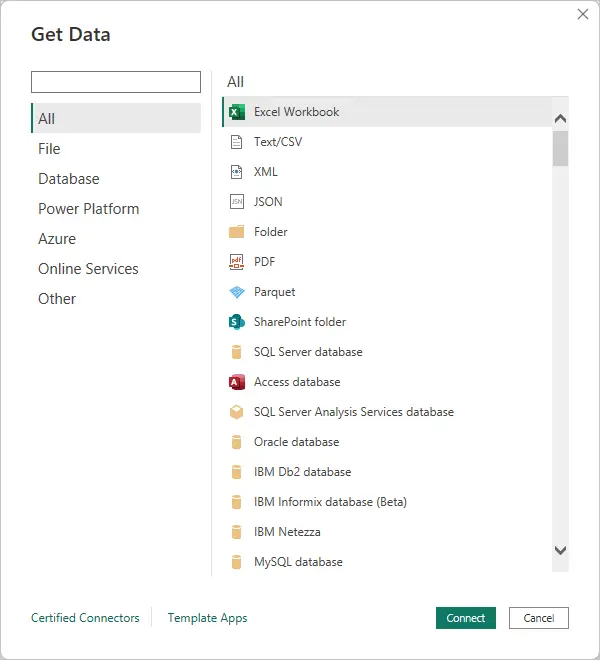
The discovery phase includes sourcing and developing an understanding of the data. Power BI facilitates this through its ability to bring in data from a huge variety of sources, which you can easily browse and search through using the Get Data screen. For my purposes, it can seamlessly pull in the SharePoint list data, which (for better or worse) makes up the lifeblood of many of our processes. I can also source data out of Planview, the project portfolio management software I use every day.
Before we can really start our data journey, though, we need to know what direction we want to go. This means approaching the data with curiosity. Often the hardest thing to figure out is what questions to ask. In the context of an organization with stakeholders, we need to find out what questions they are trying to answer too and what decisions this will inform. This is one of the value propositions offered by a business analyst specializing in data management: they can often articulate the needs of the organization from a data perspective better than anyone else.
Data Science vs. Data Analytics vs. Business Analysis
Sometimes there can be confusion between the related but very different disciplines of data analysis and data science. They differ in output, the tools employed, and methodologies. Data analysis tends to focus on producing insights from historical data to inform human action, whereas data science is often more focused on producing models or systems that can be used for predictive forecasting and automation. Data analysts speak in queries, often being quite handy with SQL, Excel, and Power BI. A typical data scientist will additionally understand programming, often knowing Python/R, statistics, and machine learning.
But where does this leave business analysis, and who are business analysts? Business analysis is, broadly, a professional discipline focused on identifying business needs and defining solutions to those needs. If that definition sounds vague, you’re not wrong. Business analysts have traditionally filled many different types of roles in organizations and within a project, and the role has evolved over the years as the discipline has matured. In a software development context, though, the business analyst is typically responsible for requirements engineering primarily, although often tasked with many other things. A good business analyst is capable of developing a shared understanding of systems and/or processes, whether that be in any current state or any potential future state.
The confusion around terminology is further exacerbated by the fact that these very different disciplines often overlap, and the lines between them can become blurry. Some data scientists do largely data analysis, for example, and some business analysts are skilled in data science or programming. There may be roles that require knowledge of all three. It’s important to understand what someone really means when they use these terms to make sure you’re all speaking the same language.
For me, some of my biggest questions concern how much we’re spending on projects in terms of resource-hours, and what the trendline is. Every month, our finance team provides a spreadsheet with the prior month’s actual hours, separated by project and by resource. This is in the form of an exploded pivot table, which we lovingly call the “actuals report.” There are a number of issues with this report, but the data, although sparse, is there.
This brings us to the other side of the discovery phase, which is seeing what is feasible given the data available. You have to identify what questions you can answer with the data and what you can’t, given the quality and type of data you have available. Power BI makes it easy to view and assess data in the Data view of the interface, which functions very similarly to a table in Excel or Access. It enables you to sort, filter, and view data quickly in a read-only format.
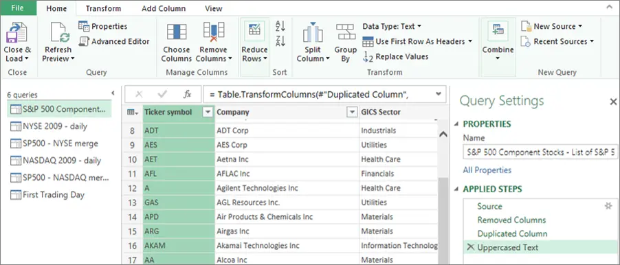
Power BI works seamlessly with Microsoft Power Query, a powerful Extract, Transform, Load (ETL) tool that can also be used with Excel. This tool allows you to wrangle data into shape in systematic, reproducible ways. We’ll make heavier use of Power Query in the data cleansing and transformation stage, but it’s also useful in the discovery phase. What’s valuable to us here is Power Query’s column profiling features. When you load data into the Power Query editor, it can show column quality (valid/error/empty percentages), value distribution, and column statistics. This allows you to quickly judge data quality and find out what data you can trust and what you can’t.
In project portfolio management, it feels like we always have more questions than answers. I feel that in some dream world somewhere, someone deals with an abundance of data in their organization, where the challenge is determining what signals to pay attention to and what to ignore. But that is not the reality I live in. The truth is I have precious little information for decision-making, and what I have is in bad condition. In scoping out the work, I need to make use of what I get, for now at least.
Data Cleansing & Transformation
One of the common challenges of dealing with data is having to clean it up before it can be of use. Data in its raw form can have corrupt or incomplete entries, be formatted incorrectly, contain duplicate values, or have other issues affecting the integrity of the data. These challenges are exacerbated when dealing with data from multiple sources in different formats.
This brings us to the next phase of the business intelligence workflow: data cleansing and transformation. These are two distinct but related activities. Cleansing is the process of correcting errors or defects in the data. Transformation is the process of modifying the data to make it more usable. Removing duplicate entries would be a data cleansing activity. Splitting a date field into component year, month, and day fields is a data transformation activity.
Before any kind of data modeling or visualization can take place, all your data needs to be changed into a consistent, structured, queryable format. Moreover, dealing with data is often more like filtering a stream than sampling a pool: you need to be able to keep up with the influx of refreshed data, so this cleansing and transformation must be repeatable.
As mentioned previously, the monthly actuals report comes to us in the form of an exploded pivot table. In this format, it’s impossible to build a data model or effectively visualize it, so we need to de-pivot the table. Fortunately, with Power Query, this is a one-click operation. Additionally, I need to standardize the date fields, split compound fields into their components, assign a type to each of the fields, and deduplicate the data.
Data Normalization
One of the practices sometimes applied to data is data normalization. Data normalization is the process of structuring (or restructuring) data to remove unstructured or redundant data. At the database table, or dataset level, data can be “normalized” into a series of numbered normal forms. Each form is essentially a set of rules that the data must meet. Each form builds on the previous one. There are many different forms you can normalize data to depending on need and application.
Data normalization can be applied at scale in an organization by developing, publishing, and enforcing standards and best practices for data. This can be as simple as requiring a consistent database table design across the organization or as complex as building out standardized and linked tables at the enterprise level. How far your organization applies data normalization practices depends in part on the maturity of the organization. In the highly regulated environments I have been familiar with over my career, a data governance organization exists for the purposes of managing these types of standards across the enterprise, but if you’re a three-person start-up, you’re not dealing with those kinds of issues.
Data for operational transactions tends to be highly normalized with minimal redundancy for efficient writing of data. Data for reporting, on the other hand, needs to be optimized for efficient reading of data. Rather than normalizing the data, we are going to build a data model. As we’ll see, this will build some selective redundancy back into the data.
Why go through all this effort? We’re doing a lot more than just tidying up. In addition to strengthening our overall data integrity, we’re setting the stage for what comes next: the data modeling work. Going into it with clean, typed data allows us to build the structure we need to effectively visualize it.
Data Modeling
The data modeling phase becomes especially important when dealing with data from multiple sources, but understanding and applying the concepts will make your data more self-serviceable and useful even if you have a single data source or are dealing with simple data structures. A fundamental concept in data modeling is splitting the data into two types: facts and dimensions. A fact is what you are measuring: numbers, typically, and their keys. A dimension is what you slice by: the descriptive context. Facts represent the how much, and dimensions are the who, what, when, and which. A data model starts by separating the data into fact and dimension tables accordingly. With this separation in place, you can then model the relationships between these fields in Power BI.
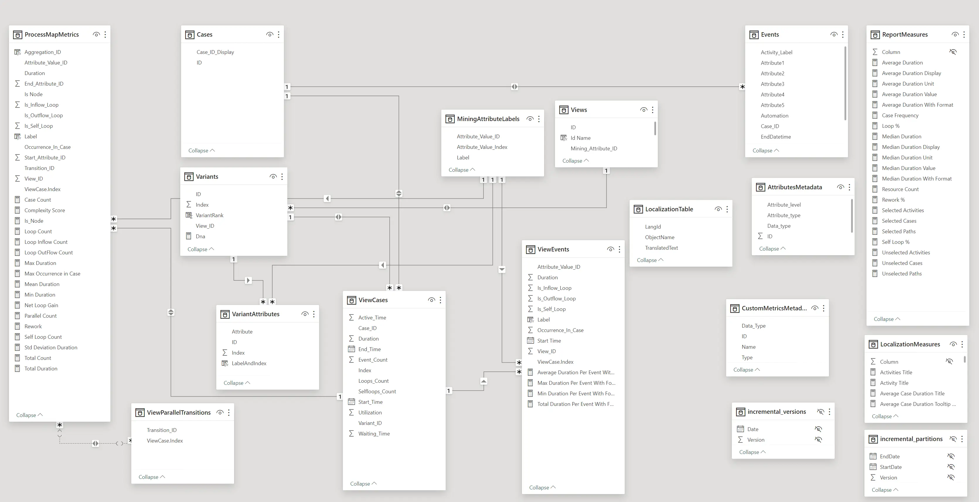
This is called dimensional modeling, and was formalized by Ralph Kimball in the 1990s. There are many benefits to building out a data model in this way, including ensuring easy compatibility with slicers—a topic we’ll explore in depth in the next part of this series when we cover the visualization stage. For now, though, just understand that by defining the relationships between facts and dimensions, we optimize our data to more easily answer questions like “What were our sales last quarter?” or “What is our resource spend by portfolio?”
This type of model is also called a star schema because of how the model looks when you draw it out. Returning to the example of my monthly actuals report, by de-pivoting the table, we have essentially created the fact table at the center of the star:
An example of a star schema in action: the monthly actuals report.
We can still enhance our data model quite a bit, because in addition to defining the relationships between facts and dimensions, we can also use the data we have available to infer new fields. For example, we can use the monthly actuals data to calculate month-over-month change in resource spend. This is where Power BI shines, by making it easy to add new measures and calculated columns scoped at the report or model level. Measures allow you to easily and quickly calculate new fields based on the existing dataset.
Measures in Power BI are defined by Data Analysis Expressions (DAX), a formula language that supports over 250 functions, operators, and constructs. If someone is comfortable writing Excel formulas, they will feel right at home using DAX in Power BI. Beyond measures, DAX can be used for calculated columns, calculated tables, and row-level security. For my report, I can add DAX formulas as new measures to find the month-over-month change in actual project resource hours.
First, we define Total Hours using a DAX formula:
Total Hours = SUM ( Actuals[Hours] )Then we can find the prior month’s hours using a second formula:
Hours Prior Month =
CALCULATE (
    SUM ( Actuals[Hours] ),
    DATEADD ( 'Date'[Date], -1, MONTH )
)
Finally, putting the two pieces together, we can build a third measure that uses the first two in its calculation:
MoM Change = [Total Hours] - [Hours Prior Month]Building out a robust data model will allow you to build better reports, answer questions more thoroughly, and optimize the data for visualization, the next stage.
What’s Next?
Up until now, we’ve been focusing on everything we need to do to make data reportable. But the real fun of Power BI is yet to come, when the data we’ve been meticulously curating will come to life with visualizations. We’ll start to see some answers to the questions that surfaced during the discovery phase, and we’ll find out how to best frame the data to tell a story.